I joined Finch (Series A) as employee 14 in 2021. As the first design hire, I was brought on to unify brand and product design. During my time, I designed and shipped early products to help the company grow to over 80 Finchmates and raise a Series B.
This case study shows my final project, which culminated in a brand refresh and a complete redesign of our homepage. My product design work will come in a future case study.
My Role
Head of Design
Year
2025

Problem
Finch’s brand identity still looked like a company that had graduated YC and not one you’d trust with critical employment infrastructure. The existing design language had gotten stale. And as we grew, our brand had to speak to two audiences — the developer who values precision, and the non-technical enterprise buyer who needs to see maturity.
One huge constraint was the brand refresh couldn’t slow down Product Design. This meant any changes to core typography and colors in the product were off limits.
Solution
The refreshed identity gave Marketing a strong foundation to build its revised messaging platform on. It also gave Design a robust system to produce fresh and compelling creative for landing pages, ads, white papers, collateral, and in-person events. Finally, Product Design never slowed down and continued to build and ship new products during and after the refresh.
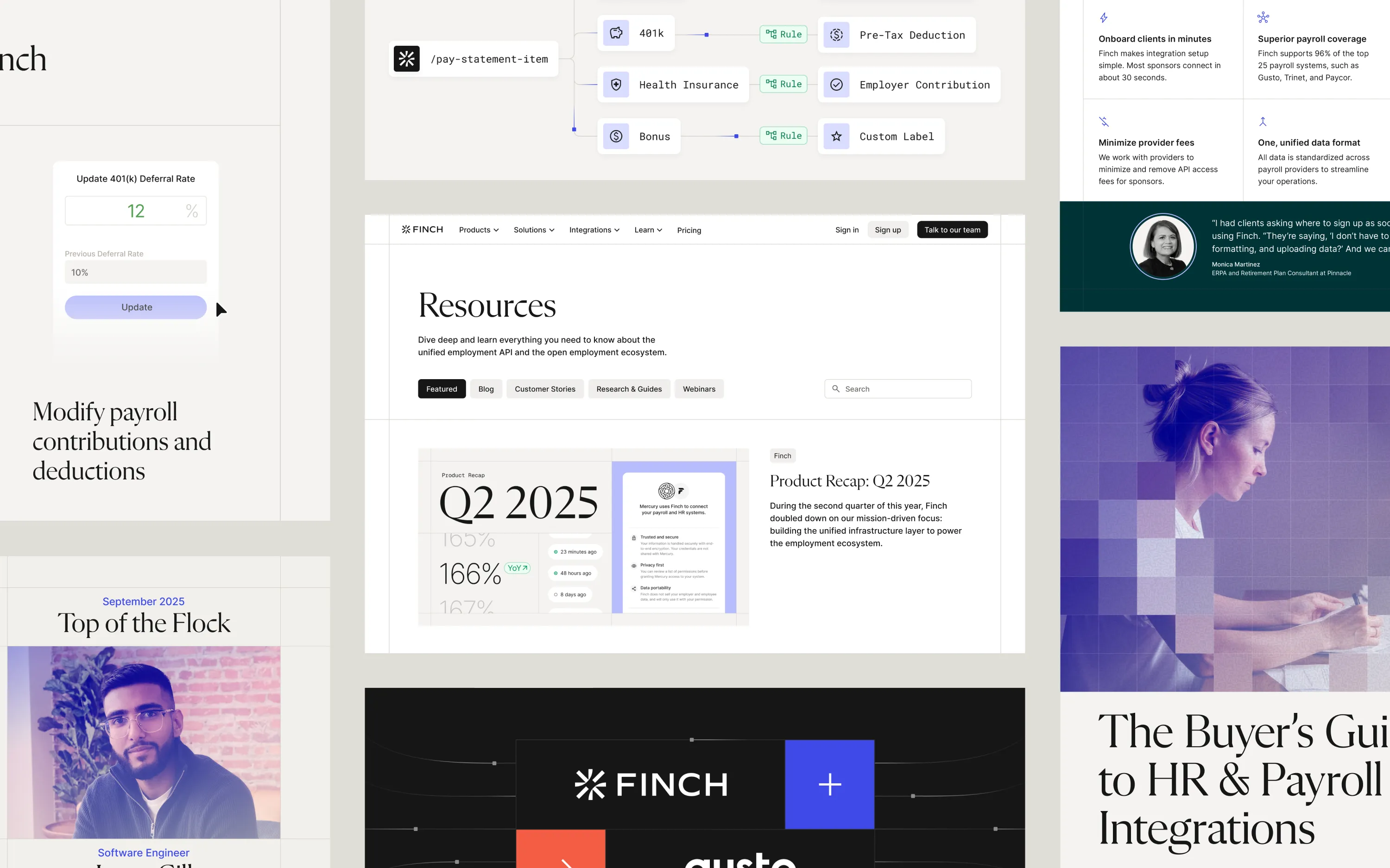
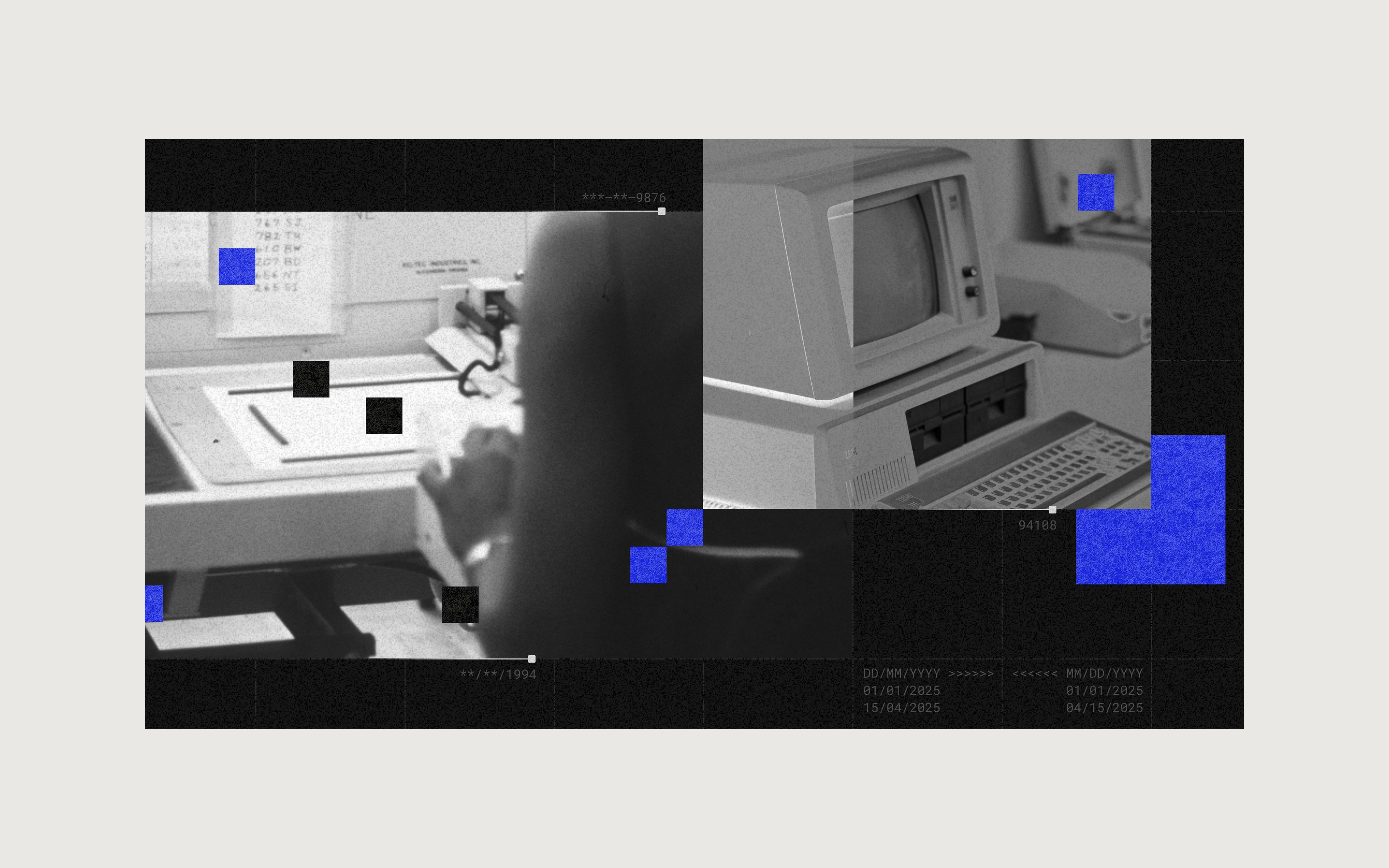
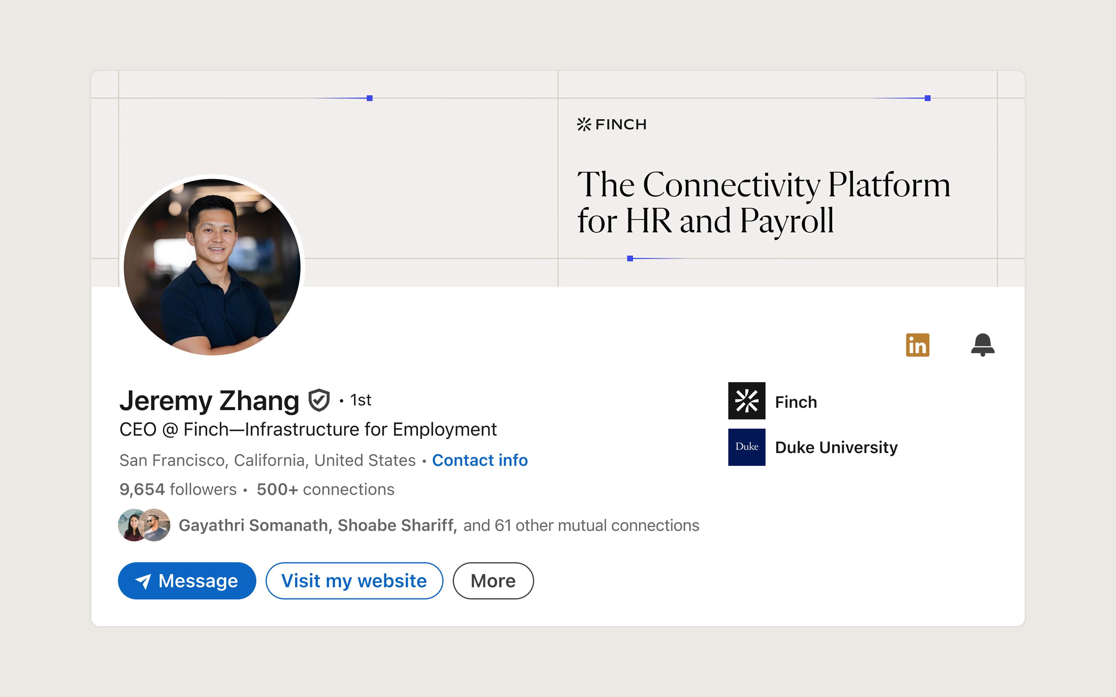
The overarching concept of the brand refresh was infrastructure made visible. Finch is building the infrastructure of employment data, so having a prominent grid became a hallmark of the visual identity.
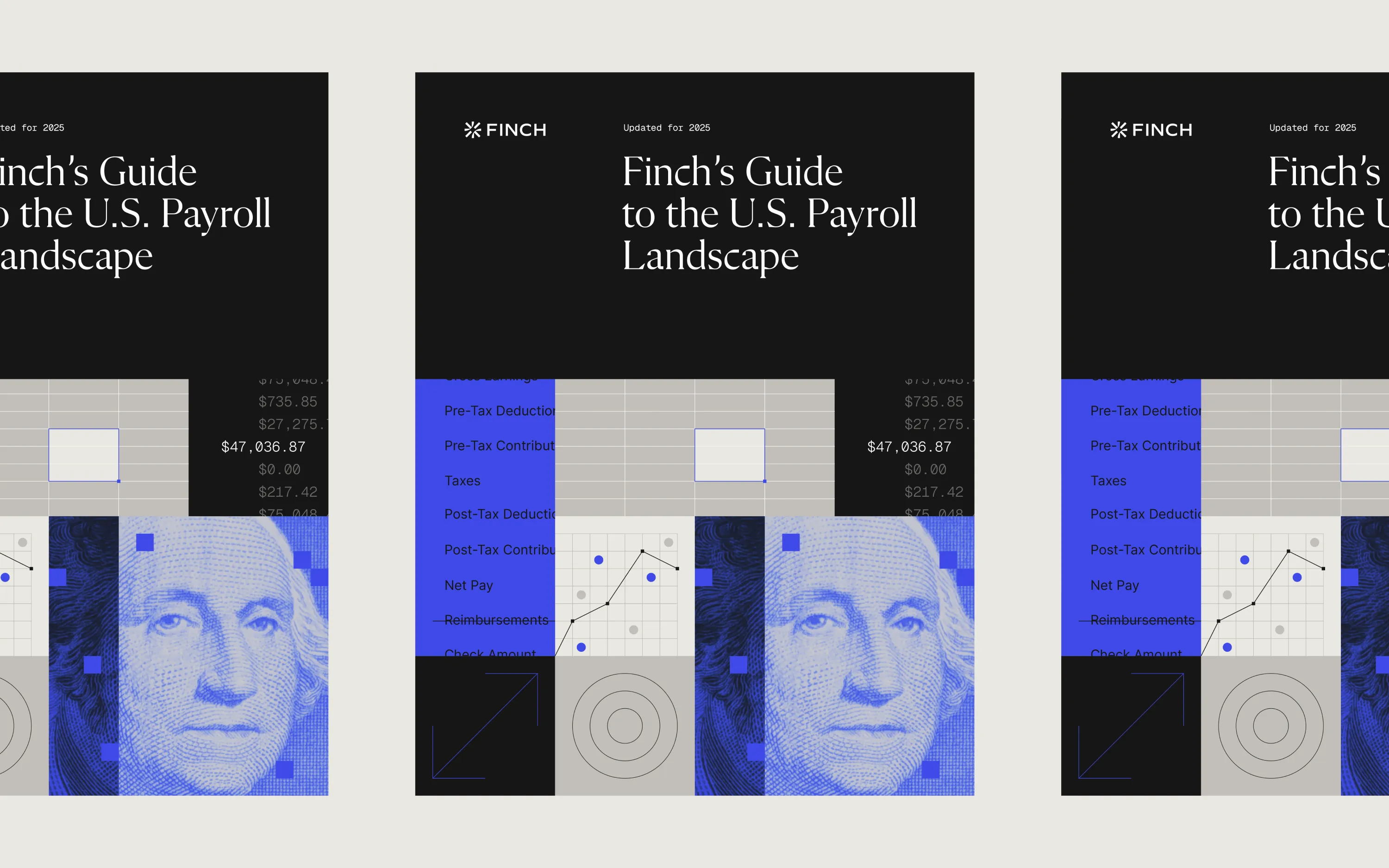
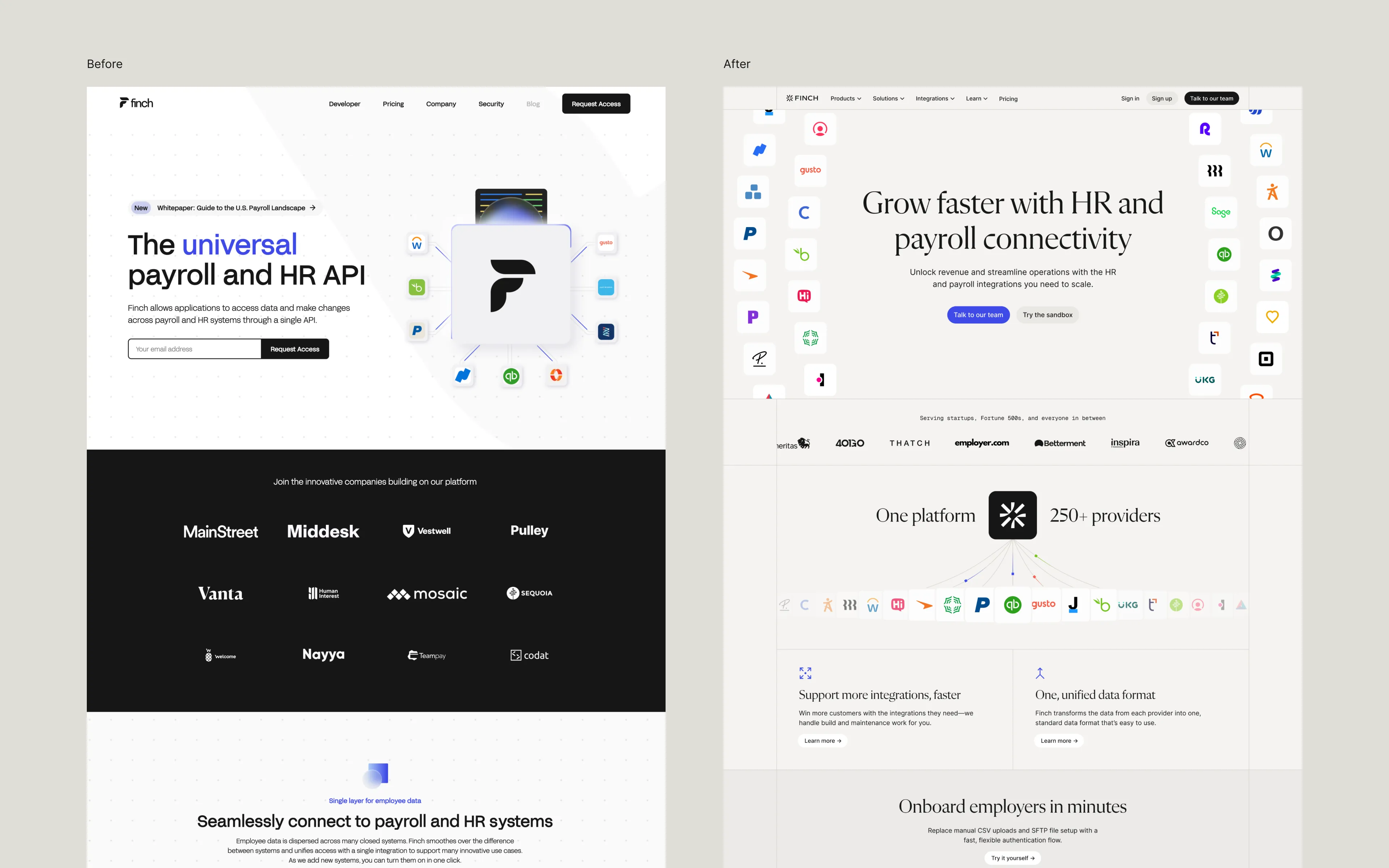
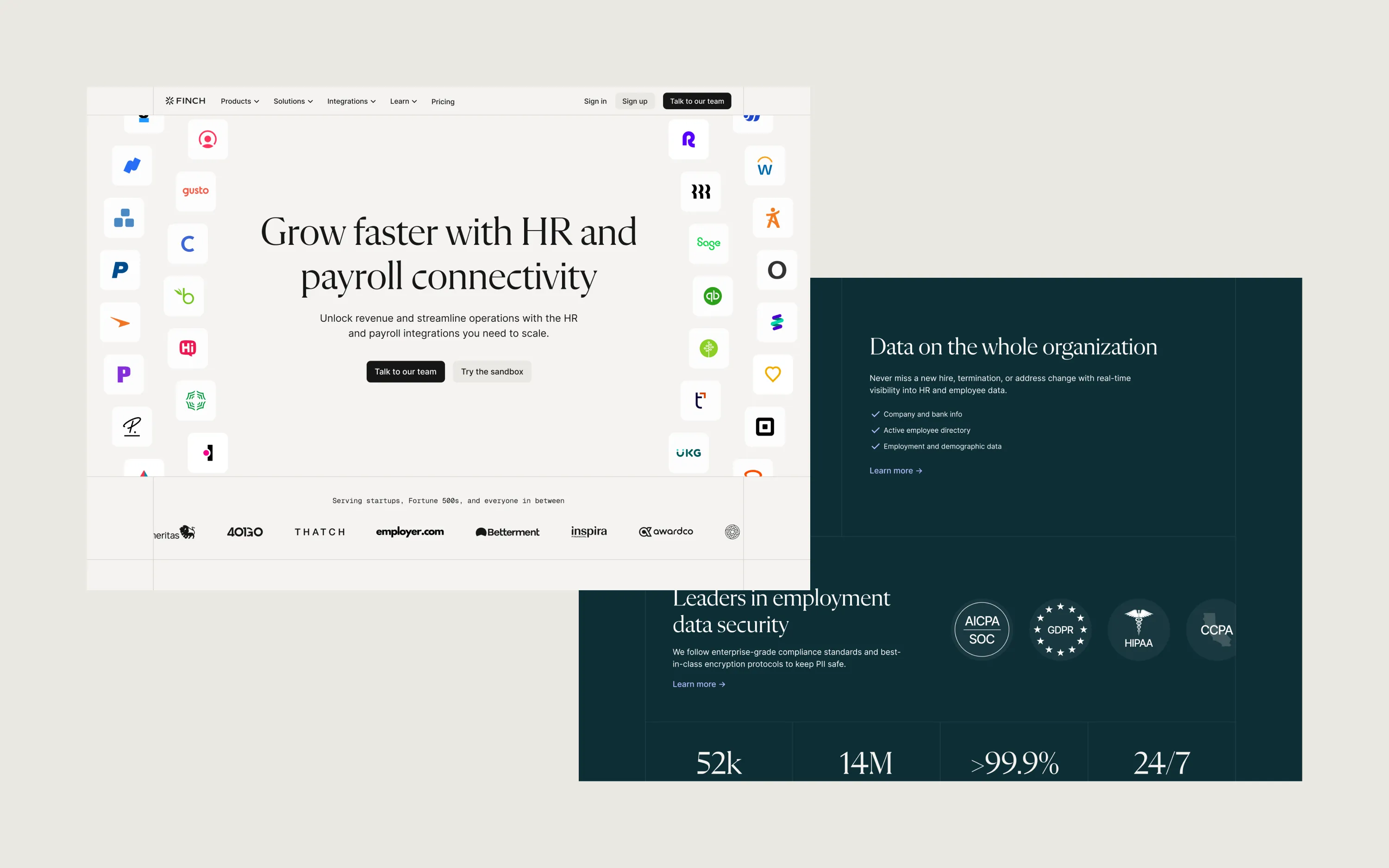
With the foundation of the brand refresh complete, I set to work redesigning our homepage. I also built out some of the key pages like Pricing and other landing page templates so the team could keep building after I handed it off.
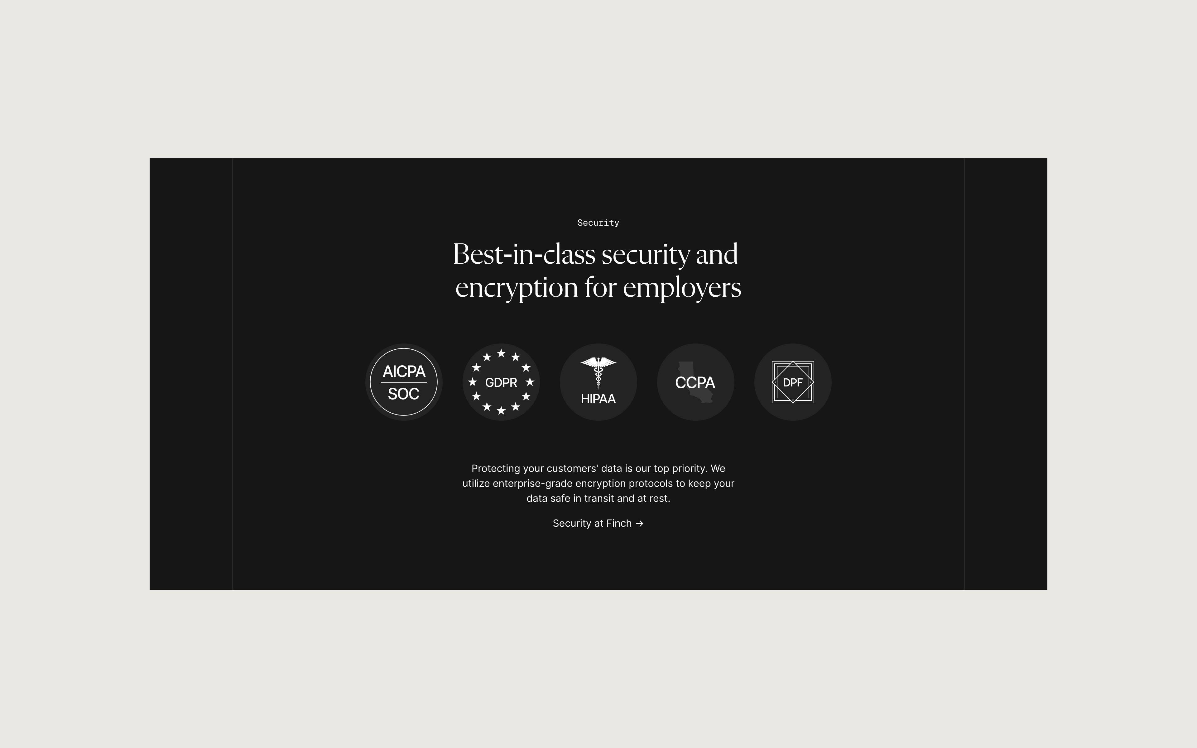
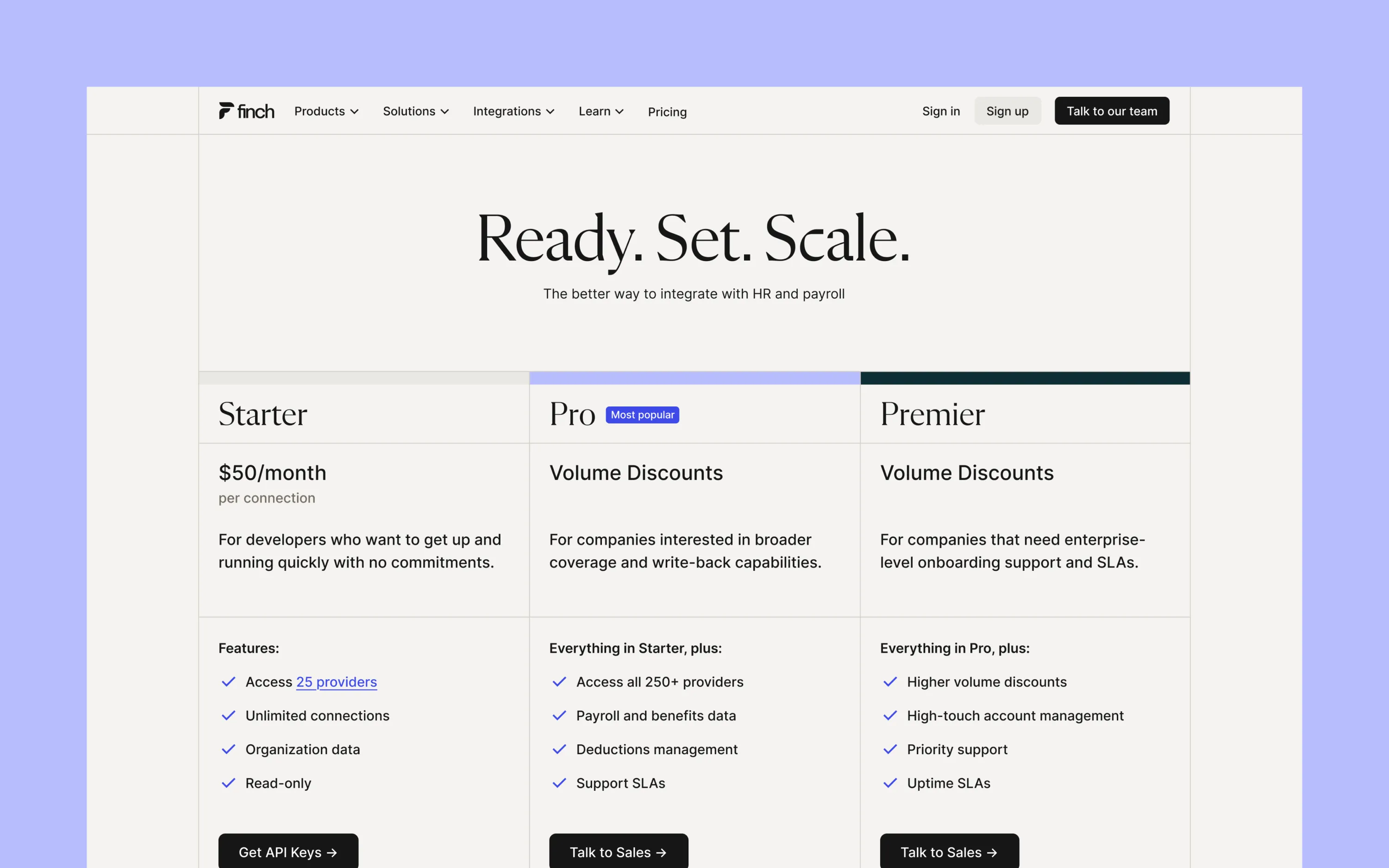
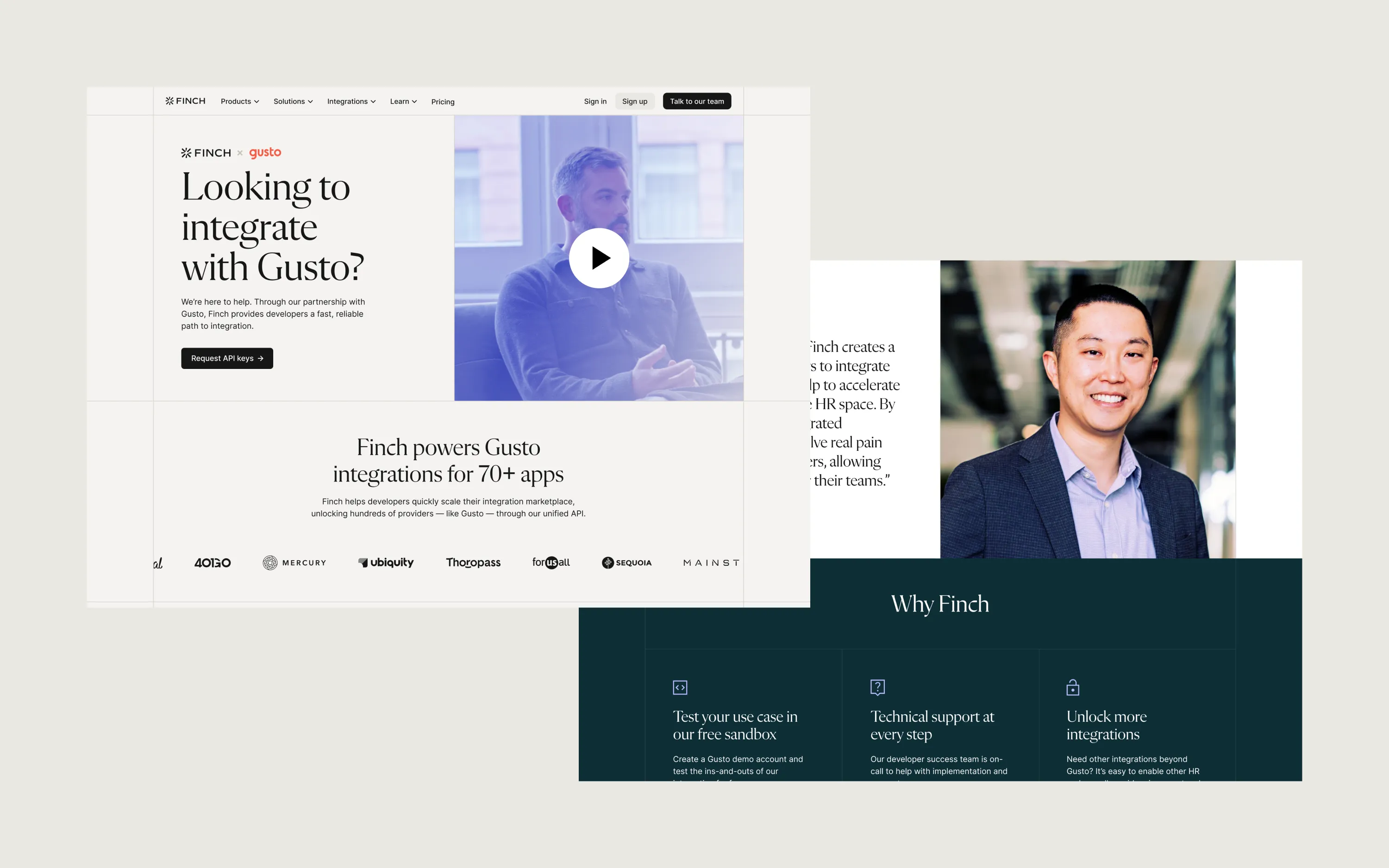
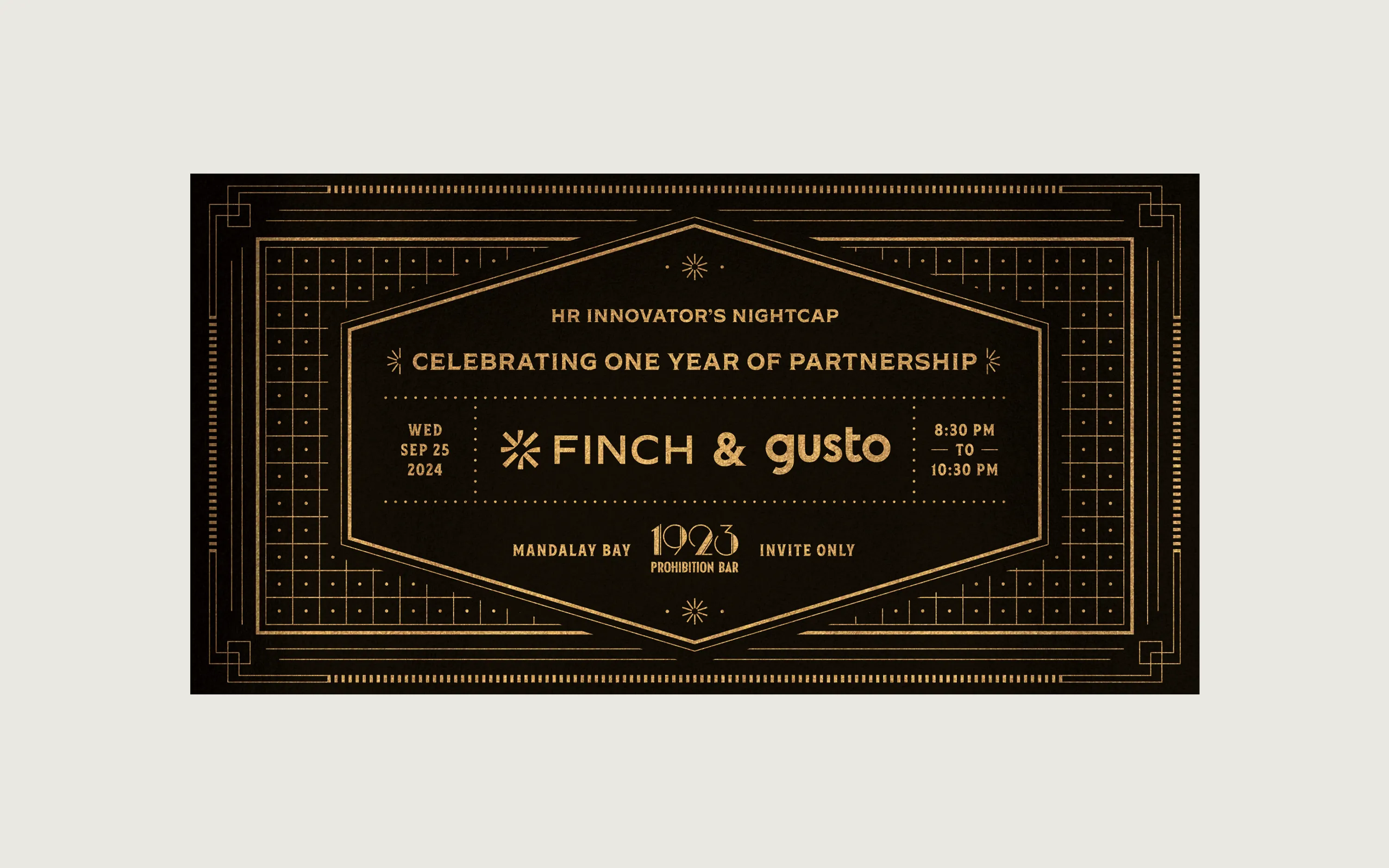
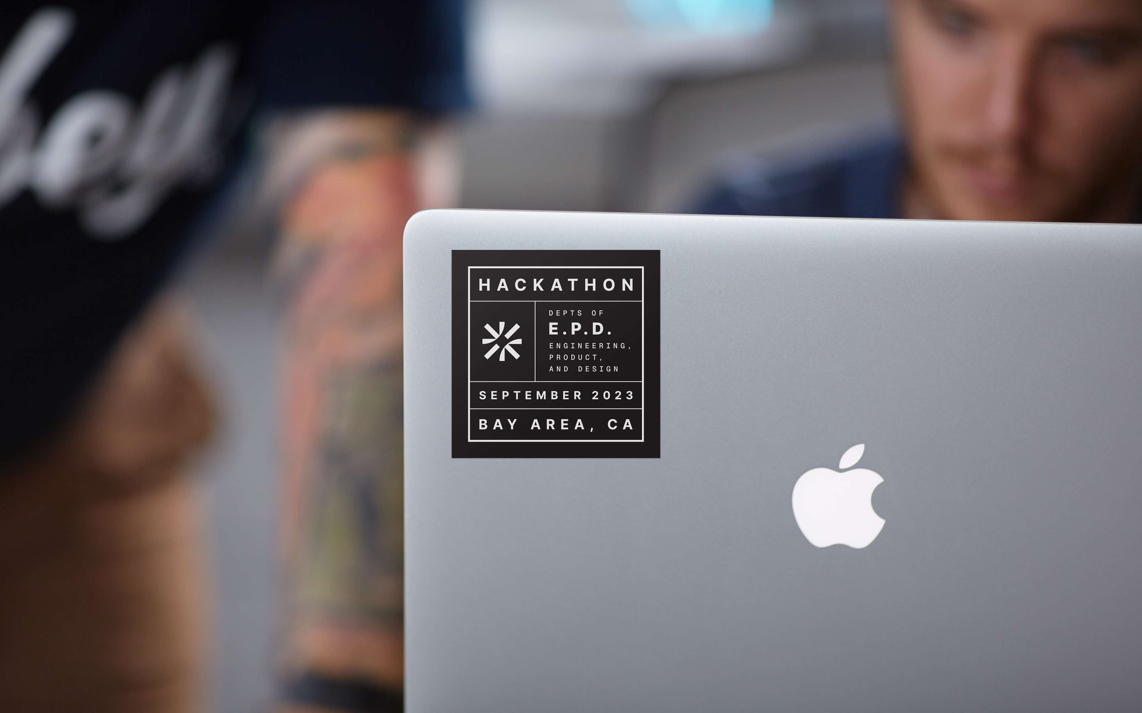
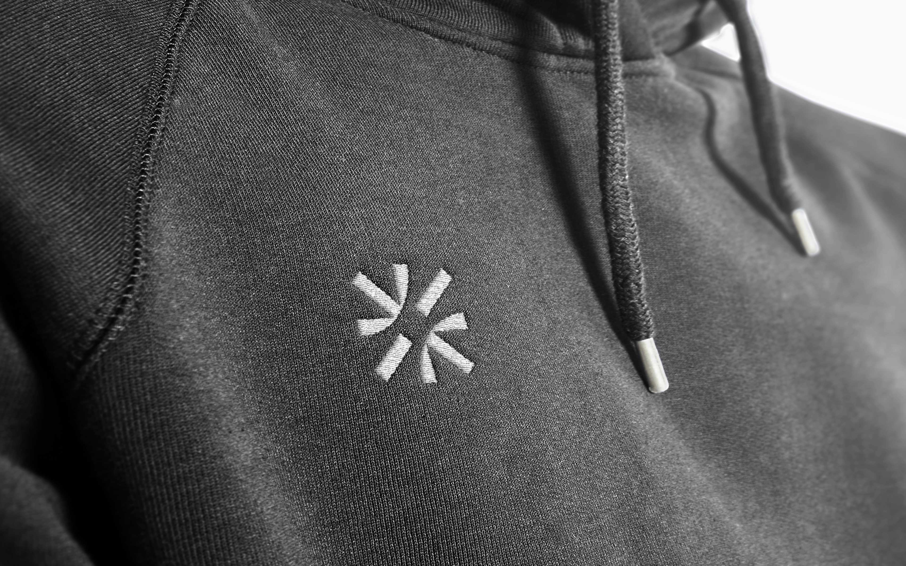
A true measure of a brand system is whether it can thrive at any scale. The same system that was used for the homepage and marketing collateral set the foundation for event invitations, social, stickers, and sweatshirts. This brand refresh gave Finch a consistent structure to work from long after my work shipped.
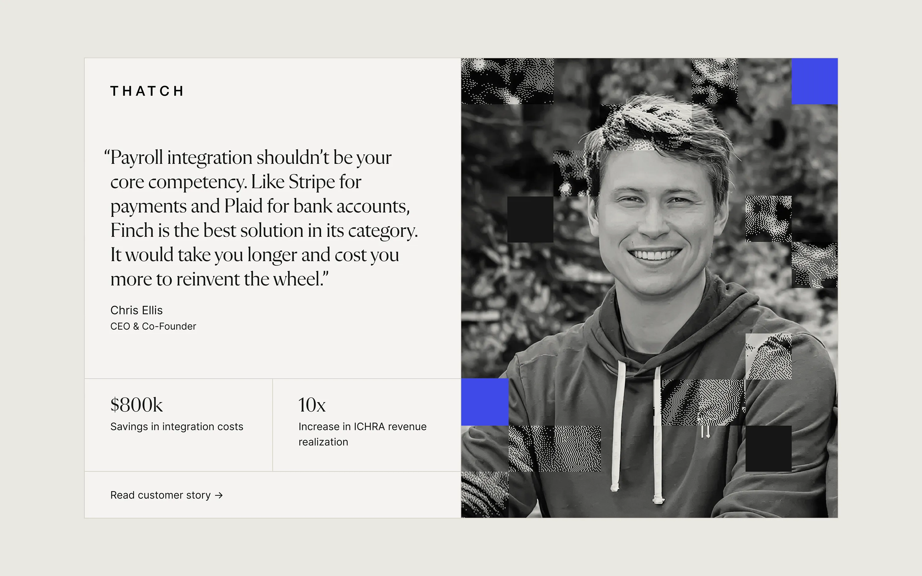
“Beyond product design, Joshua also played a key role in elevating our brand. His work has helped make our brand more distinctive and memorable. I appreciate his eye for detail and the creativity he brings to everything he works on.”

Gayathri Somanath
VP of Product, Finch
“Joshua consistently upholds an exceptionally high standard of design quality. His ability to work seamlessly across different parts of the organization ensures that design efforts are aligned with broader business goals.”

Jeremy Zhang
CEO and Co-Founder, Finch

Brand Identity
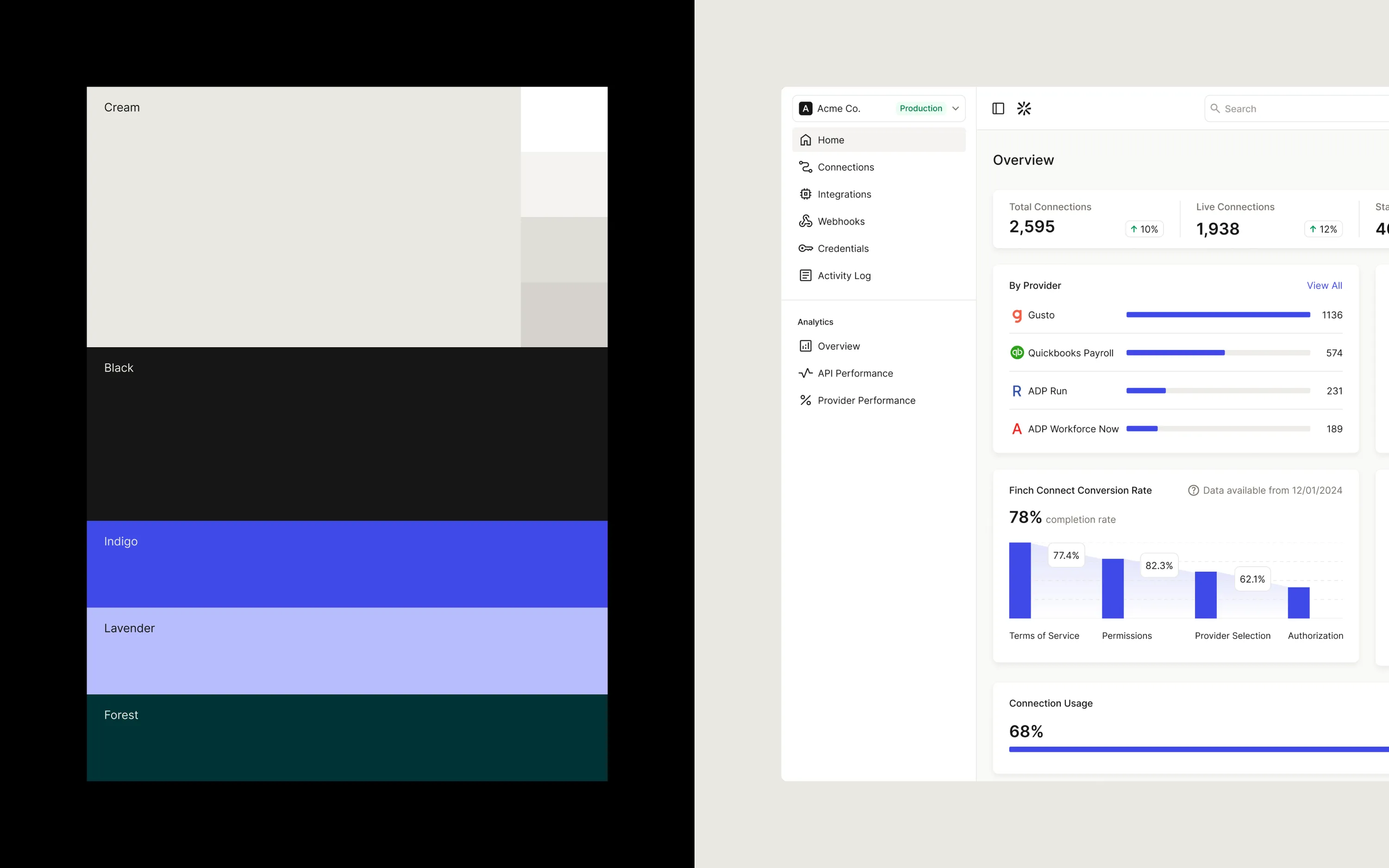
I kept the black and indigo from the core palette and supplemented them with a palette of creams. I also extended the colors to include lavender and forest green. This combination created a warm and mature brand palette that enterprise buyers were after.
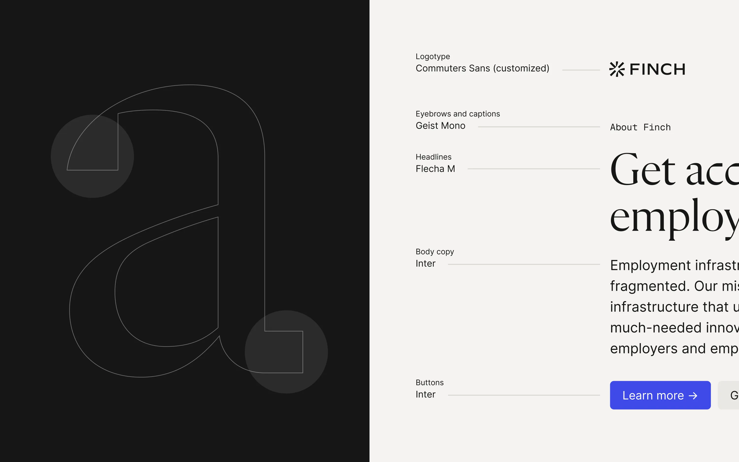
For typography, I introduced Flecha for the headline type. With its squared-off terminals, this technical serif mirrored the new grid system. Inter stuck around as the supporting typeface since it was also used in the product.